
Kamis, 29 September 2011
Introduction:
Recently a group named Anonymous Austria (twitter: AnonAustria) released a document containing almost 25.000 entries of police-men and women along with their addresses.
Whilst the data is questionable,and I don't necessarily approve of the way the data was made available, I am a sucker for all kinds of data.
Below you can view a plot of the distribution of Austrian policemen and women:
Data entries clearly align with cities and their suburbs. Vienna and Graz are a challenge in itself to overlook, given the size of the clusters. However, the data is clearer to interpret and of greater value when plotting the difference of the population density to the density of servicemen. That being said, I haven't found raw population density data yet.
Age heatmap:
The primary intend wasn't to capture the distribution of the police force in Austria. But it is admittedly fascinating to see how many well-serviced, semi-translucent police cars, all frozen in time, are driving around -collision free!- on google maps. What's really interesting would be a heatmap of age groups, that is where the most senior policemen and women are located.
Such a map could greatly sharpen one's deductive powers on calculating the risk of getting caught in a pursuit with a senior serviceman, as the ensuing aftermath to the stolen candy from the local grocery store. Candy, so I've learned as a kid, is important in keeping blood sugar balanced - no matter the delicious means.
Read more about the age distribution under the paragraph data investigation. Initially the idea was to assign the color green to the age group 10-20. It turns out 10 year olds really don't like being with the police force (even a decade later!), and as such only two data entries are assigned to this category.
Looking at the data, it appears that senior service-men and women are actually present in greater numbers in suburbian and/or country regions as well as near the border. To me, this was an astonishing result. Let me know how you would interpret this.
Implementation:
The data has been translated into geo-coordinates, a process known as Geocoding. Google is offering a serice for free, under the fitting moniker 'GeoCodeService'. You can try this right here for the address
'Schanzgasse 14 3712 Maissau' - which is located in Austria, put that's a quest for Sherlock Google to figure out.
The url contains a fixed callback function, embedded in the google maps api, a token for the service authentication and the address - url-encoded in this case.
https://maps.googleapis.com/maps/api/js/GeocodeService.Search?4sSchanzgasse%2014%3B%203712%20Maissau&7sUS&9sen-US&callback=_xdc_._jccbik&token=129739
The heatmap is simply composed of an alpha-png, with each color being assigned to a value range for one parameter - in this case the parameter is age. Much more sophisticated overlays can be created, such as isolines and isosurfaces, alongside full JavaScript interactivity.
Data investigation:
Few have actually looked at the age distribution of the published data. The data used herein is a random sample of 2765 entries of roughly 25000 entries, with no significant difference in the age groups (p<0.05). As such the sample is representative for the age-group distribution of the entire set.
The anonymized data set has been uploaded to my data-hub repository, containing useful test data sets ranging from image and video processing to web development (curation/migration of the data to the web is still ongoing).
Below is a list with the number of servicemen in decades, with 0-10 being at the very left. Unsurprisingly there are no underage servicemen in Austria (-the foreign minister will be pleased).
There are however only 2 entries for the age category 10-20, which would hint at the data being heavily skewed or biased. The origin of the data is still not known. Yet on the contrary the skewness of the data may hint at plausible sources.
a = [0, 2, 214, 477, 1005, 729, 255, 36, 29, 17, 0]
In percent of numbers, results are quicker to take in:
a.map( function(i){ return (i/a.sum()*100).toFixed(2)+'%';} )
["0.00%", "0.07%", "7.74%", "17.26%", "36.36%", "26.37%", "9.23%", "1.30%", "1.05%", "0.62%", "0.00%"]
Half of the data entries distribute to the age-group 40-50yrs, and if the age group is expanded to 40-60yrs the group will cover over three quaters of the data set. It is unlikely that this is a list of all policemen and women in active duty. Judging from the age groups, either the list is biased due to the nature of the data source, or the list is indeed unbiased and the skewness is a result of social factors (no kidding!).
Sharing the data:
You can share the data through these two links:
Conclusion:
Most interesting to me would be establishing connectivities based on the (currently) quite solid results of search engines such as google. Covering the entire connectivity space, would mean (n-1)^n queries would have to be invoked.
For 25.000 entries thats 600 million queries. At a rate of 20 queries per second, this would amount to pretty much one year (347.2d).If multiple entities are packed in one query, which from my experience is sensible for a maximum of four entries (google), the time can be cut down to a quarter. If moreover the queries are restricted to a single city, an intercity-wide network of people can be created in just a few days.

In one instance a link was provided for a male and female officer, both of whom were living in the 'Oedenburgerstrasse', except the former in '7062 Burgenland' and another in '1210 Wien' i.e. dozens of kilometers apart. Whilst 'Oedenburgerstrasse' does indeed exist in both provinces, it may be that the data is simply wrong. The difficult part is scoring the google data-result, with the intend of calculating a testable hypothesis. One important metric is simply the string distance of two queried entries, and afaik google doesn't provide this yet. Much more sophisticated algorithms have been developed.
Generating such networks of people based on scored data which is mined from the web, could prove very insightful in missing children's cases, where details may have been overlooked. Details which manifested on the web in hindsight of preceding or currently emanating information, as part of the crowd-intelligence.
Edits:
Note:
Unfortunately, google's TOS don't approve of data mining strategies. But google does provide a rich service infrastructure which in some cases can nullify the necessity for data mining altogether.
All sources have been put on github. All data is anonymized.
Recently a group named Anonymous Austria (twitter: AnonAustria) released a document containing almost 25.000 entries of police-men and women along with their addresses.
Whilst the data is questionable,and I don't necessarily approve of the way the data was made available, I am a sucker for all kinds of data.
Below you can view a plot of the distribution of Austrian policemen and women:
Data entries clearly align with cities and their suburbs. Vienna and Graz are a challenge in itself to overlook, given the size of the clusters. However, the data is clearer to interpret and of greater value when plotting the difference of the population density to the density of servicemen. That being said, I haven't found raw population density data yet.
Age heatmap:
The primary intend wasn't to capture the distribution of the police force in Austria. But it is admittedly fascinating to see how many well-serviced, semi-translucent police cars, all frozen in time, are driving around -collision free!- on google maps. What's really interesting would be a heatmap of age groups, that is where the most senior policemen and women are located.
Such a map could greatly sharpen one's deductive powers on calculating the risk of getting caught in a pursuit with a senior serviceman, as the ensuing aftermath to the stolen candy from the local grocery store. Candy, so I've learned as a kid, is important in keeping blood sugar balanced - no matter the delicious means.
Read more about the age distribution under the paragraph data investigation. Initially the idea was to assign the color green to the age group 10-20. It turns out 10 year olds really don't like being with the police force (even a decade later!), and as such only two data entries are assigned to this category.
Color->weight fixed. blue:10-20yrs, green:20-30yrs, yellow:30-40yrs, amber:40-50yrs, red >60yrs;
Looking at the data, it appears that senior service-men and women are actually present in greater numbers in suburbian and/or country regions as well as near the border. To me, this was an astonishing result. Let me know how you would interpret this.
Implementation:
The data has been translated into geo-coordinates, a process known as Geocoding. Google is offering a serice for free, under the fitting moniker 'GeoCodeService'. You can try this right here for the address
'Schanzgasse 14 3712 Maissau' - which is located in Austria, put that's a quest for Sherlock Google to figure out.
The url contains a fixed callback function, embedded in the google maps api, a token for the service authentication and the address - url-encoded in this case.
https://maps.googleapis.com/maps/api/js/GeocodeService.Search?4sSchanzgasse%2014%3B%203712%20Maissau&7sUS&9sen-US&callback=_xdc_._jccbik&token=129739
The heatmap is simply composed of an alpha-png, with each color being assigned to a value range for one parameter - in this case the parameter is age. Much more sophisticated overlays can be created, such as isolines and isosurfaces, alongside full JavaScript interactivity.
Data investigation:
Few have actually looked at the age distribution of the published data. The data used herein is a random sample of 2765 entries of roughly 25000 entries, with no significant difference in the age groups (p<0.05). As such the sample is representative for the age-group distribution of the entire set.
The anonymized data set has been uploaded to my data-hub repository, containing useful test data sets ranging from image and video processing to web development (curation/migration of the data to the web is still ongoing).
Below is a list with the number of servicemen in decades, with 0-10 being at the very left. Unsurprisingly there are no underage servicemen in Austria (-the foreign minister will be pleased).
There are however only 2 entries for the age category 10-20, which would hint at the data being heavily skewed or biased. The origin of the data is still not known. Yet on the contrary the skewness of the data may hint at plausible sources.
 |
| Age distribution of the general Austrian population peaking at the age class 40-50yrs |
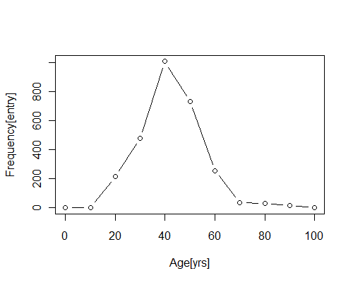 |
| Age distribution of the data set, created w. R: plot(seq(0,100,10),c(0, 2, 214, 477, 1005, 729, 255, 36, 29, 17, 0),type="b",xlab="Age[yrs]", ylab="Frequency[entry]") |
a = [0, 2, 214, 477, 1005, 729, 255, 36, 29, 17, 0]
In percent of numbers, results are quicker to take in:
a.map( function(i){ return (i/a.sum()*100).toFixed(2)+'%';} )
["0.00%", "0.07%", "7.74%", "17.26%", "36.36%", "26.37%", "9.23%", "1.30%", "1.05%", "0.62%", "0.00%"]
Half of the data entries distribute to the age-group 40-50yrs, and if the age group is expanded to 40-60yrs the group will cover over three quaters of the data set. It is unlikely that this is a list of all policemen and women in active duty. Judging from the age groups, either the list is biased due to the nature of the data source, or the list is indeed unbiased and the skewness is a result of social factors (no kidding!).
Sharing the data:
You can share the data through these two links:
- Showing the distribution:
- http://lsauer.github.com/scripts_n_snips/poldistr.html
- Showing the age heatmap
- http://lsauer.github.com/scripts_n_snips/poldistr.html?heatmap
<iframe border="0" src="http://lsauer.github.com/scripts_n_snips/poldistr.html"
  style="border-radius: 5px; border: 2px solid #ccc; height: 450px; padding: 10px; width: 98%;">
</iframe>
Conclusion:
Most interesting to me would be establishing connectivities based on the (currently) quite solid results of search engines such as google. Covering the entire connectivity space, would mean (n-1)^n queries would have to be invoked.
For 25.000 entries thats 600 million queries. At a rate of 20 queries per second, this would amount to pretty much one year (347.2d).If multiple entities are packed in one query, which from my experience is sensible for a maximum of four entries (google), the time can be cut down to a quarter. If moreover the queries are restricted to a single city, an intercity-wide network of people can be created in just a few days.
In one instance a link was provided for a male and female officer, both of whom were living in the 'Oedenburgerstrasse', except the former in '7062 Burgenland' and another in '1210 Wien' i.e. dozens of kilometers apart. Whilst 'Oedenburgerstrasse' does indeed exist in both provinces, it may be that the data is simply wrong. The difficult part is scoring the google data-result, with the intend of calculating a testable hypothesis. One important metric is simply the string distance of two queried entries, and afaik google doesn't provide this yet. Much more sophisticated algorithms have been developed.
Generating such networks of people based on scored data which is mined from the web, could prove very insightful in missing children's cases, where details may have been overlooked. Details which manifested on the web in hindsight of preceding or currently emanating information, as part of the crowd-intelligence.
Edits:
- Added the age distribution of the austrian population from wolfram alpha
- A comment and a twitter post (fatmike182) informed me that the data is supposedly from a police club, which explains the divergence of the data from the expectation value based on the general population.
- 30/10/11: Assigned the color-weight and size of the green overlay to the same values as the other colors, for a more realistic representation.
Note:
Unfortunately, google's TOS don't approve of data mining strategies. But google does provide a rich service infrastructure which in some cases can nullify the necessity for data mining altogether.
All sources have been put on github. All data is anonymized.